
Accessibility guidance
Accessibility and form help
The inquiry form is built to work with a keyboard, a screen reader, and browser zoom, not just a mouse. This page explains how labels, error messages, and success messages are announced, what contrast and focus behavior you can expect, and what to do if something still blocks you.
Where to start
Three things make the rest of this page easier to use: the form has one clear route through it, every field keeps its name, and nothing on the page moves or plays sound on its own.
- Labels
- Every input keeps a visible label above it that screen readers announce as you move through the form.
- Keyboard
- Tab moves forward, Shift+Tab moves back, and a visible focus outline marks where you are.
- Fallbacks
- If the form will not let you through, the desk phone and email take the inquiry the same way.
Labels that stay put and get announced
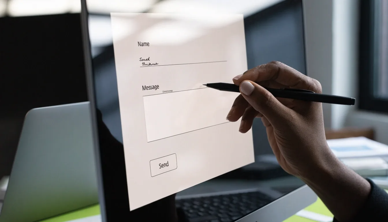
Every input has a visible label sitting above it, coded so screen readers announce the field name as you move through the form. The label does not vanish when you start typing, unlike placeholder-only designs.
That matters because a field with no persistent label is hard to revisit. Once text is entered, a placeholder disappears and the field loses its name. Here, the name stays. If you tab back to a field you already filled, you hear the same field label you heard the first time, not an empty prompt or a fragment of your own text read back as if it were the name.
Required fields are marked in that same visible label, so the requirement is announced with the field name rather than saved for submit time.
Moving through the form with a keyboard
Tab and Shift+Tab
Tab moves forward through the fields, Shift+Tab moves back. Nothing on the page traps focus or jumps you into a different order than the one you see on screen.
Visible focus outline
The focus outline stays visible around the control you are on, at a contrast you can follow against the white form surface, so you always know where the next keystroke lands.
No mouse required
If you use a keyboard, you can complete the whole form without touching a mouse. Required fields are announced as required, so submit time holds no surprises.
What the error messages say
When validation fails, an error message appears beside the exact field with the problem, and it is announced by screen readers rather than only changing color. The message names the problem, not just the field.
Correcting the field clears the message. Nothing else you typed is discarded, so you can fix one thing without redoing the rest of the form.
If the field is empty
Enter your email address.
The message sits directly under the field it belongs to and is read aloud when focus returns to that field.
If the field is malformed
The message explains what the field expects instead of only reporting a failure.
Nothing else you typed is cleared, so you keep your message and phone number while you fix the address.
Color is never the only signal. Each error carries wording, a position beside its field, and an announcement, so it reads the same whether you see it or hear it.
The success message and why it is explicit
On a valid submission, the page loads a confirmation screen with a heading that reads as a success message and repeats the email address you entered. Screen readers announce this heading when the page loads. A confirmation email follows.
This is deliberate. An ambiguous end state leaves people unsure whether to resend, and resending clogs the desk. Explicit success feedback removes the doubt: you can see your address on screen and know the inquiry landed.
What happens after you submit
Announced on load
The confirmation heading is the first thing a screen reader reaches on the new screen, and the email address you entered is repeated in the body text below it.
Contrast on a white page
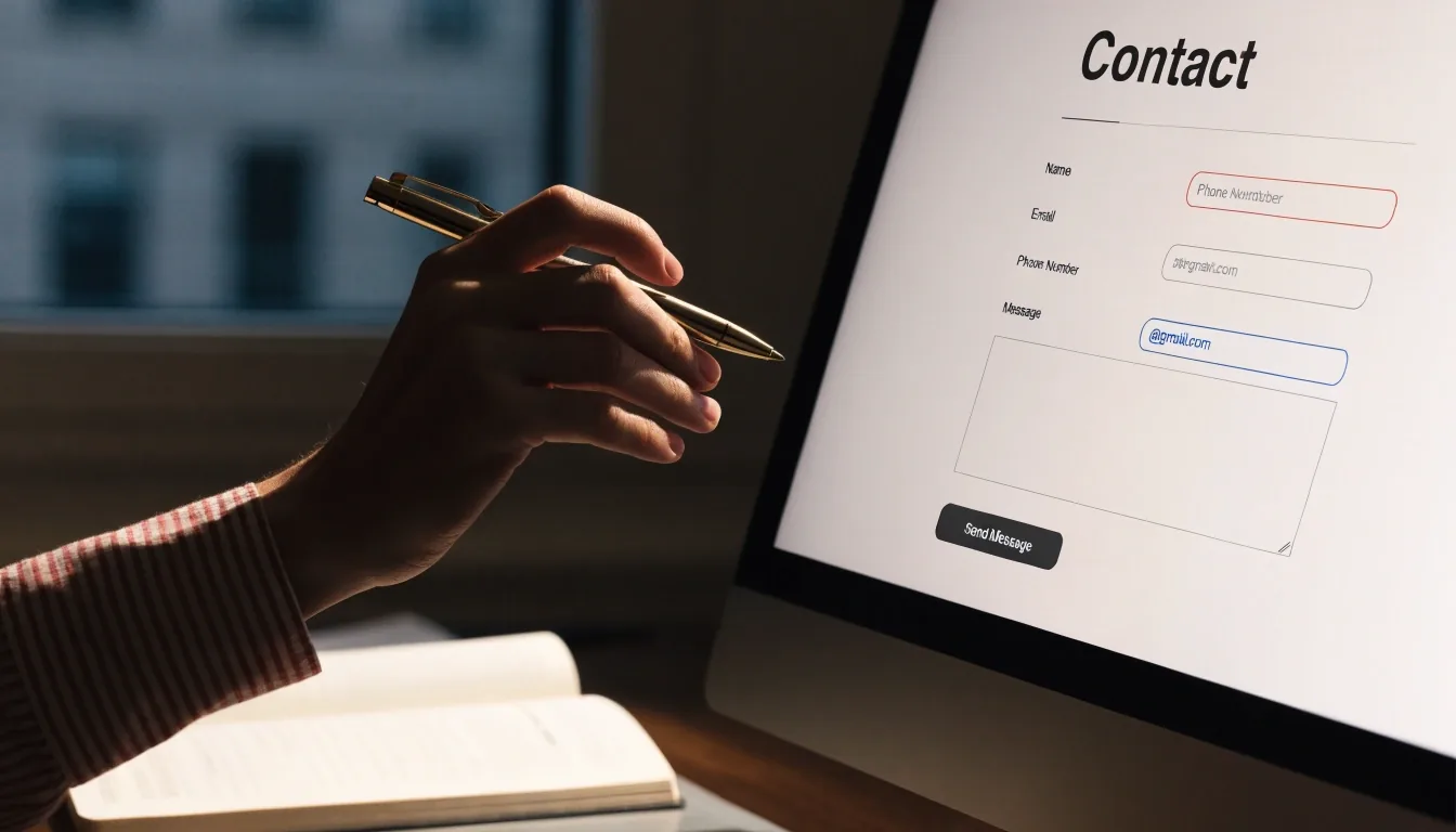
A white contact page can drift into faint gray text and hairline borders that look elegant but fail to read. Here, labels, borders, helper text, and error text are all kept at contrast levels strong enough to remain legible, including error red on white.
Zoom to 200%
The layout reflows rather than clipping, and the text stays readable without horizontal scrolling. Nothing sits in a container narrow enough to hide its own content when enlarged.
Borders and helper text
Field borders and helper lines stay dark enough to find, so the shape of each input is obvious to sighted keyboard users as well as to anyone zooming in.
Error red
Error text is set dark enough to read against white, and it is paired with wording and position, so the color is a cue and never the message itself.
Using a screen reader with the form
The form is structured with proper field-to-label association, so each input is announced with its name and type. Error messages are tied to their fields and announced when focus returns. The submit button reads as a button.
-
Field-to-label association
Each input is announced with its name and type, so you know what the field wants before you type into it. The association holds when you return to the field after an error.
-
Errors tied to fields
Validation messages are coded to their own field and announced when focus returns there, rather than appearing somewhere else on the page with no link back.
-
The submit button
The submit button reads as a button with its own label, so screen reader users are not left guessing whether a clickable element was a link, a tab, or the control that sends the form.
-
If something misreads
If your screen reader skips a field or misreads a label, note which one and tell the desk. Concrete reports like that are how the form gets fixed.
If the form still will not let you through
Sometimes the blocker is outside the form: a strict script blocker, an outdated browser, or a network hiccup mid-submit. Try another browser, or allow scripts for this page, then reload.
If that fails, call the desk during business hours at the number on the contact page, or email the address in the footer. The desk can take your inquiry by phone and log it the same way a form submission is logged. Calling is not a lesser route, and you will not be asked to try the form again first.
Reach the desk directly
Falkeris Inquiry Desk
4823 Maple Avenue, Chicago, IL 60640
Phone: +1 312-508-3887
Email: [email protected]
Monday to Friday, 9:00 AM – 6:00 PM. Saturday, 10:00 AM – 2:00 PM. Messages left outside those hours are read on the next business day.
Directions and travel detailsCaptions, language, and reading order
Page text is written in plain English, and the document is marked with its language so screen readers pronounce it correctly instead of switching to another voice partway through a sentence.
Headings in order
Headings run in order, so you can jump between sections by heading rather than reading every line of the page to find the part you need.
No autoplay or motion
There are no auto-playing sounds or moving elements to fight with, so nothing starts talking over your screen reader or pulls your place on the page.
Reading order matches the screen
Reading order follows the visual order, which keeps navigation predictable for keyboard and screen-reader users alike. When you move to the next element, it is the element you would expect to reach next.
Asking for another format
If you need the form's content in a different format, such as larger text, a plain document, or a phone walkthrough, ask. The desk can take your details over the phone and send a written summary afterward.
Accessibility requests are treated as ordinary inquiries, logged and answered within the usual reply window, not sent to a separate queue that never moves. Tell us what works better for you and we will use that route for this request and for the next one.
Ask for larger text, a plain document, or a walkthrough by phone. There is no separate form to fill in and no extra approval step.
A short checklist before you submit
Run through these four steps once. They take about a minute and they catch most of the small things that make a form feel broken.

-
1
Tab through the form once
Confirm each field announces its own label as you land on it, and that the focus outline is visible on every stop.
-
2
Fill in name, email, and message
Leave the phone field blank unless you want a call back. Required fields are marked in the label, so you know before you submit.
-
3
Submit and read the confirmation
Check that you land on the success screen with your email address shown, and that the heading is announced when the new page loads.
-
4
Report anything that misbehaves
If a step fails, note the field and what happened, then tell the desk by phone or email so it can be corrected.
Questions we get asked
Short answers to the three things people ask about the form most often. If your question is not here, the desk will answer it by phone or email.
Does the form work with a screen reader?
Yes. Fields are tied to visible labels that are announced, and error and success messages are coded to be announced as well.
Is the form usable with a keyboard alone?
Yes. Tab and Shift+Tab move through the fields with a visible focus outline, and no step requires a mouse.
What if I cannot use the form at all?
Call the desk during business hours. A team member can take your inquiry by phone and log it the same way a form submission is logged.
If the form fails you, call instead
The desk phone is the fallback, and calling it is not a lesser route. Someone can take your details, log the inquiry the same way a submission is logged, and send a written summary afterward if you want one.